1.2. Prior knowledge and interests of EE 508 students: pandas#
This exercise gets you started with the basic functionality of pandas: importing data, analyzing it, visualizing it, computing new indicators, and plotting the results.
Before you start, do the introductory readings for pandas:
Deliverables
Three histograms of the distribution of the average prior knowledge of Fall 2025 students by category (coding, statistics, spatial data & processing).
Two horizontal bar plots of the average level of software knowledge and the thematic interests of Fall 2025 students (one bar for each software / interest).
Due date
Tuesday, September 16, 2025, by 6:00 p.m.
1.2.1. Get the survey data#
Download the survey data from the EE 508 drive:
-
ee508_survey_anonymized.csv - the survey data
ee508_survey_fields.csv - shortcuts for field names
1.2.2. Create a new notebook#
Activate your conda environment and start jupyter notebook.
Open a new Jupyter notebook: ~/ee508/notebooks/lab1/lab1-2.ipynb
Load the required modules by running this code at the beginning of the notebook. The first line makes plots appear below the cells.
%matplotlib inline
import pandas as pd
import matplotlib.pyplot as plt
from pathlib import Path
But wait … these aren’t in the “right” order.
Good that we have a code formatter installed. Right-click on the white area to the left of the cell > Format cell.
The cell input should change to:
%matplotlib inline
from pathlib import Path

import matplotlib.pyplot as plt
import pandas as pd
This regrouping follows the (very reasonable) rules of isort: Python functions first, then external packages, then own packages - and all in alphabetic order.
Important
Please use Format cell religiously across your Jupyter notebooks. This allows you to submit consistent-looking code for all of your assignments. It’s like running spell check before you hand in a report.
1.2.2.1. Define your file paths#
Throughout EE 508, we will be using pathlib’s Path object to write paths to directories and files. That way, our filepaths will work across operating systems (Mac, Windows, Linux).
Here’s how I define my directories and filepaths for Lab 1.2:
# EE 508 home directory
DIR_EE508 = (
    Path('~').expanduser() / 'Dropbox' / 'Outputs' / 'Courses' / 'ee508'
)

# Directory for Lab 1.2
DIR_LAB1_2 = DIR_EE508 / 'data' / 'processed' / 'lab1' / 'part2'

# Path to survey data file
PATH_SURVEY_ANONYMIZED = DIR_LAB1_2 / 'ee508_survey_anonymized.csv'

# Path to survey fields file
PATH_SURVEY_FIELDS = DIR_LAB1_2 / 'ee508_survey_fields.csv'

# Directory for figures for Lab 1
DIR_FIGURES_LAB1 = DIR_EE508 / 'reports' / 'figure' / 'lab1'
Adapt it to your directory structure. I’ll use these constants later in the script.
Note
I used UPPERCASE letters for all filepaths because they are constants.
Following PEP8 convention:
Please always use uppercase letters for script-level constants (variables that you define and don’t change for the remainder of the script)
Define all script-level constants at the beginning of your script, right after the
importstatements.
1.2.3. Import the survey data#
Load the survey data into a DataFrame with pandas. Use pd.read_csv to load the data and assign it to a new Python object that you name d (shorthand for data).
If you forgot how to call
pd.read_csvfind it again in 10 Minutes to pandas.Or ask the function for its help:
help(pd.read_csv)
You can also write this iPyton magic:
?pd.read_csvYou get the same content, different presentation.
Tip
You can expand your Python skills rapidly by calling help() on every function you use.
Because read_csv has so many options, its help is a little unwieldy. Luckily, it comes with easy examples at the bottom. pandas is good about that.
1.2.4. Assign an index#
Check out what columns exist: d.columns. They have short names.
Use the (anonymized) student names as the index (row names):
d = d.set_index('name')
Note
Setting a column as the index with set_index() will remove the column from the list of columns. Therefore, you can run this exact command only once after importing the file. If you run it twice without re-importing, you get an error.
If you wish to keep the column 'name', you can set the index with:
d.index = d['name']
Caution
pandas allows you to use non-unique indices (i.e., indices with duplicates). This can lead to unexpected results, e.g., the creation of duplicates when joining data. If you want to ensure your index is unique, you can double-check it as follows:
d.index.duplicated().any()
The questions associated with each column are in ee508_survey_fields.csv.
Load this tabular data into a variable you name
fields.Display
fieldsand compare the list of'new'column names to the list of columns ind.
1.2.5. Explore the survey data#
d.head() shows you the first 5 rows. It’s a good way to get a first impression of what data is in a DataFrame.
Tip
Notice how the pandas DataFrame doesn’t display all columns by default.
The middle ones are omitted (…). This avoids the accidental display of very large DataFrames, which can slow down your browser.
Run pd.options.display.max_columns to see how many columns are allowed.
If you want to see more, you can change this value:
pd.options.display.max_columns=100
For more info, consult the full list of pandas options.
During exploratory analysis, I often find myself changing display.max_rows, display.min_rows, and display.max_colwidth.
If the top rows are not representative, d.sample(5) gives you five random rows. d.T will transpose a DataFrame. Whenever I open a new dataset, I like to get a quick first sense of columns, values, and completeness by running d.sample(5).T .
Question
How have students rated their prior experience with spatial data processing in R?
fields tells us that the corresponding column has the name 'sw_r_spatial'.
Run
d['sw_r_spatial']. What does it do?Run
d[['sw_r_spatial']]. What does it do?To understand the difference between the two commands, enclose both of the above statements with
type()and run them again. In what way are the outputs different?If you forgot why, revisit the Selection section in 10 minutes to pandas.
Run d['sw_r_spatial'].ge(3). What does this function do?
Explore the list of available binary operator functions.
What do you get if you run
d['sw_r_spatial'] >= 3?What do you get if you run
d[['sw_r_spatial']].ge(3)? What explains the difference?Run
d['sw_r_spatial'].ge(3).sum(). What does this number represent?Explore the list of available descriptive statistics.
Question
Can you correct this code, so it produces the same output as d['sw_r_spatial'].ge(3).sum()?
d['sw_r_spatial']>=3.sum()
Run d['sw_r_spatial'].value_counts(). What does this function do?
How many students are in the dataset? len(d)
This is more students than are in the class. Why?
d['class'].value_counts()The dataset contains students from previous years. Let’s filter them out:
d = d[d['class'].eq('2025_fall')]
len(d)
Note the three instructions in the first line of code and their execution order:
We create a boolean Series that is
Truefor all rows we want to keep (those with the string'2025_fall'in the'class'column) andFalsefor all others.We index (using square brackets) the DataFrame
dwith the boolean Series, which returns the filtered DataFrame.We assign the returned filtered DataFrame to the (same) variable name
d. Because of this last step,dnow contains only current students.
This code gives you the same result:
d = d[d['class'] == '2023_fall']
Important
From here on onward, this lab continues with the data for current students (make sure to keep the filtering step in your pipeline if you re-run the code).
Review
Review this section and commit to memory how pandas interprets indexing very differently depending on whether you pass:
a string (
str, returns a column as aSeries)a
listof strings (returns aDataFramewith selected columns)a
Seriesofbool(returns a selection / slice of rows).
1.2.6. Visualize the data#
Plot the histogram of the variable we just examined:
d['sw_r_spatial'].hist()
Histograms of small counts of integer values don’t look so great by default: bars can be to the right, middle, or left of their respective value.
A better alternative is a barplot of counts:
dp = d['sw_r_spatial'].value_counts()
dp.plot(kind='bar')
value_counts() automatically sorts observed values by frequencies. If you prefer the index values to be displayed in order, you can add .sort_index() to the Series returned by value_counts().
dp = d['sw_r_spatial'].value_counts().sort_index()
dp.plot(kind='bar')
What kind of object does the plot() command return? Find out
by reading it into a variable that you name ax (i.e., prefix
the last line of code with ax =), then run:
type(ax)
The object is an Axes object, defined by matplotlib (https://matplotlib.org/stable/api/axes_api.html).
matplotlib is the most widespread package used for plotting in Python. Axes are the objects that do the drawing (Artist in matplotlib)
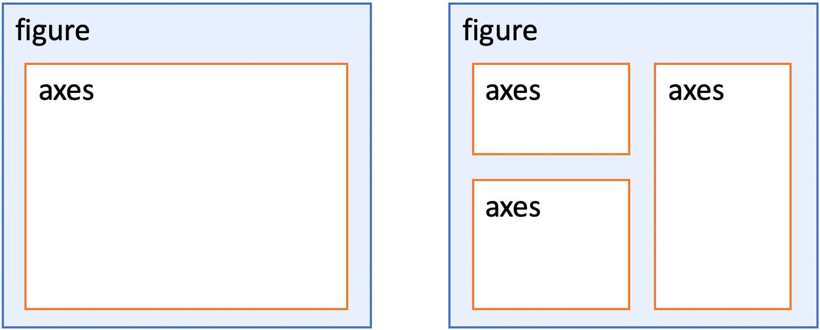
Each Axes object defines a subplot on a Figure: a cartesian coordinate system (2D axes) on we will plot all data we want to visualize in this class (graphs, vector maps, images).
Each Axes object belongs to a matplotlib Figure (customarily named fig). Figures can have one or more Axes (subplots, customarily named ax):
Why is this important?
You need
Axesobjects to manipulate details of the graph you’re working on (e.g., add layers or data, change labels, colors, grids, or ticks).You need the
Figureobject to change attributes of the overall figure (e.g., size, layout, saving).If you would like to have more control over your visuals, I recommend consulting the matplotlib Quick start guide and Pyplot tutorials.
The plot() command we called on the Series dp is a shortcut provided by pandas for quick visualizatoin of data via matplotlib. If you want to get the Figure and Axes objects to tweak the figure, you have two options:
Initialize the matplotlib plot with
plt.subplots().This function returns the
FigureandAxesobject(s) as atuple. You can save theaxobject and pass it as an argument topandas’plot()function.fig, ax = plt.subplots() dp.plot(kind='bar', ax=ax)
Alternatively, you can save the
Axesobject returned bypandas’plot()shortcut and get the figure frommatplotlibwithplt.gcf()(“get current figure”)ax = dp.plot(kind='bar') fig = plt.gcf()
I recommend the first option if you plan to go beyond quick exploratory analysis.
You can also pass the number of rows and columns as the first two arguments to create layouts with multiple plots. In this case, plt.subplots returns not a single Axes object, but an array (rows and/or columns) of several Axes objects. In that setup, the individual subplots can be accessed with their indices in the array:
fig, axes = plt.subplots(1, 2)
dp.plot(kind='bar', ax=axes[0])
dp.plot(kind='bar', ax=axes[1], color='crimson')
fig.set_size_inches(7, 3)
Important
When you configure Jupyter such that it visualizes matplotlib plots below the cell (%matplotlib inline), matplotlib discards the figure after plotting it. This means that you need to keep all commands for a plot in the same notebook cell.
Tweak the resulting plot by adding a title (in the same cell).
ax.set_title('Spatial R', fontsize=20, pad=15)
The optional
padargument defines the distance between the plot and the title.Another way of adding a title (without the
axobject) is via thematplotlib.pyplotinterface, which we imported at the beginning asplt:plt.title('Spatial R', fontsize=20, pad=15)
Question
How many students said they have prior experience with R?
Find the right column name in fields, then plot the values.
You will note that one possible value (
2) does not exist in the data. If you want to show the full range of values (1to5) on the x axis, you need to add the missing values to the Series created byvalue_counts().One way is to save the
Seriesreturned byvalue_counts(), add a zero (no responses) to the index value2(which also means the value2is added to the index of theSeries), and sort theSeriesby its index before plotting the values:dp = d['sw_r'].value_counts() dp[2] = 0 dp.sort_index().plot(kind='barh')
1.2.7. Create and visualize new indicators#
Question
What is the distribution of the knowledge of all listed spatial data skills across all students?
For each student, compute the average number of points that they have given themselves across all spatial data processing skills (those beginning with 'spat')
Generate a list of all these variables with a Python list comprehension.
List comprehensions are concise expressions to generate lists or dictionaries.
spat_cols = [v for v in d.columns if v.startswith('spat')]
This is an elegant (“Pythonic”) way of writing this four-line
forloop:spat_cols = [] for v in d.columns: if v.startswith('spat'): spat_cols.append(v) # alternative: spat_cols += [v]
Note how
d.columnsis used as an iterator that returns the columns names as a string (v).startswith()is one of many useful Python string methods.Check out the Python documentation on String Methods, especially
endswith(),upper(),lower(),title(),replace(),strip(), andzfill().
You can now subset the
DataFramewith your new list:d[spat_cols]
Or you can do both in one line:
d[[v for v in d.columns if d.startswith('spat')]]
Once you have subset the DataFrame, you can compute column or row means:
Across columns (skills):
d[spat_cols].mean()Across rows (students):
d[spat_cols].mean(1)
Plot the means quickly by adding .plot(kind='bar') to the end.
The vertical bar plot has vertically oriented labels on the x axis. These can be difficult to read. If you have long labels, a horizontal bar plot is usually the better choice. That takes just one more letter: .plot(kind='barh')
One inconvenience of the horizontal bar plot is that, by default, the first items are at the bottom of the graph. To change that, invert the Series you plot by using [::-1]:
d[spat_cols].mean()[::-1].plot(kind='barh')
Note: the odd-looking command
[::-1]can also reverse any list or tuple.
You can add a number of arguments to the plot call (after kind='...', separated with commas) to make the horizontal bar plot look more the way you want:
figsize=(10, 7)will increase your plot size (width and height in inches)fontsize=15will increase the label fontsize.xlim=(1, 3)will re-scale the x-axis to the correct value range.
For all of these shortcut arguments provided by pandas, there are also corresponding commands that you can access via ax or fig:
fig.set_size_inches(10, 7)
ax.tick_params(axis='both', labelsize=15)
ax.set_xlim(1, 3)
Although the latter commands are usually a little longer, it’s good to practice using them. These commands give you fine-grained control over any
matplotlibplot, regardless of which package or shortcut was used to create that plot. For instance,hist()doesn’t accept anxlimortitleargument, but you might still be interested in changing these attributes afterhist()has been called. Luckily, you can pass anaxargument from an initialized plot tohist():fig, ax = plt.subplots() d['sw_r_spatial'].hist(ax=ax)
hist()automatically plots a grid. If you don’t like the grid, you can turn it off via theAxesobject:ax.grid(False)
1.2.8. Save a figure#
You have two options to save your figure:
The quick version: hold Shift and right-click on the image in Jupyter to save it as a file. (Holding Shift is necessary on Jupyter notebook 7 to access your browser’s normal right-click popup menu). You obtain a low-resolution image that is fine for email, but not necessarily for publication.
For a high-resolution version, add these lines to the end of the same Jupyter cell in which you called the
plotorhistfunction:PATH_FIGURE = DIR_FIGURES_LAB1 / '2_fig_example.png' plt.savefig(PATH_FIGURE, bbox_inches='tight', dpi=150)
This will save your figure with a transparent background. If you prefer a solid white background, add the argument
facecolor='white'
Nice job!
You just learned a number of skills that that are useful to have in your digital toolset. Now you can apply what you learned to generate the deliverables:
1.2.9. Create the deliverables#
A figure with three histograms (arranged horizontally) showing the distribution of per-student average skill levels within each category:
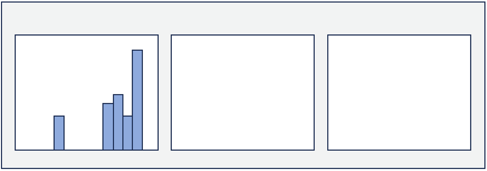
Use
plt.subplots()to initialize a figure with threeAxesarranged horizontally.Make it 7” wide and 3” high.
For each student in the current class, compute their average score across all skills within each category.
Do this separately for the three categories: coding (
code_), statistics (stat_), spatial data (spat_).This should give you one average value per student per category.
For each of the three categories, create a histogram (not
barh) that shows the distribution of these per-student averages. Plot each histogram on one of theAxesobjects.For instance, if you saved the (
numpy) array of the threeAxesreturned byplt.subplots()asaxesyou can select individualAxesto pass them to the plotting function, e.g.ax=axes[0]).
Make sure the x-axis extent covers the right range (1–3). Add an informative title to each histogram. Save a 150 dpi version of the figure at this filepath:
~/ee508/reports/figures/lab1/2_ee508_skills_hist.png
Important: Here you are grouping by student (averaging within each student, then comparing between students).
A figure with two barplots showing the class average level for each software skill and each interest.
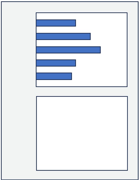
Use
plt.subplots()to initialize a figure with twoAxesarranged vertically. Make it 4” wide and 6” high.For each software type (
sw_), compute the average score across all students (i.e. one value per software type). Create a horizontal bar plot that shows these averages and plot it on the upper axes. Add a title, make it look nice, and choose the correct x-axis extent (1–5).Do the same for each self-reported interest (
int_): compute the average score across all students (i.e. one number per interest). Plot these averages as a horizontal barplot on the lower axes.The title of the lower plot might overlap with the labels of the y-axis of the upper plot. The quickest way to resolve this issue is a matplotlib shortcut which automatically chooses a spacing which resolves such overlaps:
plt.tight_layout()
Save a 150 dpi version of the figure at:
~/ee508/reports/figures/lab1/2_ee508_sw_int.png
Important: Here you are grouping by skill/interest (averaging across students, then comparing between skills).
Reflect
Take some time to appreciate the results. How diverse are the prior skills of the students in this course? What are you, as a group, most interested in?
1.2.10. Independent coding challenge#
Question
Does this cohort look different than the previous ones?
Create a new version of ~/ee508/reports/figures/lab1/2_ee508_skills_hist.png, plotting the histograms of students that are not in the current cohort behind the histogram of students that are in the current cohort. (You will have to backtrack and re-load the survey responses to get all students back.)
You can plot two histograms (or any matplotlib layers) on top of each other by passing them the same ax object. For instances, if you have created a Series with values of current students (d_current) and a Series with the values of prior students (d_prior), you can plot their histograms on top of each other like this (ax has to already exist).
d_current.hist(ax=ax, alpha=0.5, color='red')
d_prior.hist(ax=ax, alpha=0.5, color='blue')
Tip
You will reuse this “layering” of plot elements: this is how we plot map elements on top of each other (e.g., a county boundary on top of a raster image).
alpha=0.5adds transparency, so the lower histogram stays visible.Save a 150dpi version at:
~/ee508/reports/figures/lab1/2_ee508_skills_hist_prior.png
1.2.11. Wrap up#
Your folder ~/ee508/reports/figures/lab1/ should now contain all deliverables:
2_ee508_skills_hist.png2_ee508_sw_int.png2_ee508_skills_hist_prior.png
Compress the three files into a single .zip archive.
Find the Google Assignment with the lab title on the Blackboard course website:
Upload your .zip archive.
You’re done!
That’s it.
I hope you enjoyed your first steps in pandas!
Bring your questions and opinions to class!