1.3. Countries and threatened species with geopandas#
This lab will get us started with geopandas, a Python package for geospatial vector data (shapefiles, geopackages, geodatabases, geoparquet, etc.). We import, filter, and reproject geospatial polygons, compute areas, and make maps. We will also start using zonal_stats, a way to compute statistics on pixels grouped by (separate) polygon vector data.
Deliverables
A map of average threatened species richness by country subdivision, saved as a .png image.
A list of the ten countries that contain the country subdivisions with the highest average threatened species richness, saved as a .csv file.
Due date
Friday, September 19, 2025, by 6:00 p.m.
1.3.1. Create a new notebook#
Start Jupyter, open a new notebook (~/ee508/notebooks/lab1/lab1-3.ipynb), and run the following import commands:
%matplotlib inline
import geopandas as gpd
import matplotlib.pyplot as plt
from pathlib import Path
import pandas as pd
from rasterstats import zonal_stats
Are these in the right order? Right-click to the left of cell > Format cell to find out.
Define your filepaths, e.g. with pathlib.
# Directories and file paths
DIR_EE508 = (
    Path("~").expanduser() / 'Dropbox' / 'Outputs' / 'Courses' / 'ee508'
)
DIR_LAB1_1 = DIR_EE508 / 'data' / 'external' / 'lab1' / 'part1'
DIR_REPORTS_LAB1_3 = DIR_EE508 / 'reports' / 'lab1' / 'part3'

PATH_NE_COUNTRIES = (
    DIR_LAB1_1
    / 'ne_10m_admin_0_countries_lakes'
    / 'ne_10m_admin_0_countries_lakes.shp'
)
PATH_NE_SUBDIVISIONS = (
    DIR_LAB1_1
    / 'ne_10m_admin_1_states_provinces_lakes'
    / 'ne_10m_admin_1_states_provinces_lakes.shp'
)
1.3.2. Load and explore the vector data#
Use geopandas to load the country shapefile from Countries and threatened species with QGIS.
countries = gpd.read_file(PATH_NE_COUNTRIES)
What variable type is countries? type(countries) will tell you.
A
GeoDataFrameis a special kind ofDataFramethat comes with a geo-referencedgeometrycolumn. This colum contains the geo-referenced vector data (points, lines, polygons, multi-polygons) linked to each row in the frame.
Plot the object: countries.plot(figsize=(7, 4)). You should see a map of the world.
The
figsizeargument (width, height in inches) is optional. However, if you just callcountries.plot(), the map tends to be on the small side.Similar to
DataFrameandSeriesobjects inpandas, theGeoDataFramefromgeopandasoffers thisplot()shortcut tomatplotlib.As in pandas, you can first create a
FigureandAxesusingplt.subplots(), tell theGeoDataFrametoplot()on the sameax. After that, we can tweak the plot further.fig, ax = plt.subplots() countries.plot(ax=ax) fig.set_size_inches(7, 4)
Alternatively, you can capture the
Axesobject returned bygeopandas’plotfunction to edit the plot further:ax = countries.plot(figsize=(7, 4)) ax.axis('off')
What columns are available to you in the attribute table? countries.columns will tell you.
The geometry column contains the geospatial data as a special type of Series. Which type? Run type(countries['geometry']) to find out.
Caution
If you drop the geometry column, the GeoDataFrame loses its vector data and can’t be plotted as a map anymore. Try:
countries.drop(columns='geometry').plot()
So: if you want to keep the vector data, don’t drop the geometry column.
Any slice (subset) of the GeoDataFrame that does not contain a geometry column will be treated as a pandas DataFrame. See what Python returns for each of these two commands:
type(countries[['NAME', 'POP_EST', 'geometry']])
type(countries[['NAME', 'POP_EST']])
1.3.3. Index and filter#
You select rows and columns of a GeoDataFrame in same way you’d do it with a DataFrame. For instance, here is how you can make a map of mainland China:
countries[countries['SOVEREIGNT'].eq('China')].plot()
Look at a sample of the country attribute data using: countries.sample(5).T.
The attribute table has many columns we don’t need. Let’s keep only what we want.
Before we start filtering, let’s give countries a good index.
I like to keep my indices unique (avoids duplicates when joining) and meaningful: the index should make it easy (a) to understand what type of unit each row refers to, and (b) to recognize a unit by its index value (e.g., a name or widespread code).
Caution
Like pandas, geopandas allows non-unique indices in its GeoDataFrame.
You are responsible for making sure your index is unique (if you need it to be).
Looking at the sample, the column 'SOVEREIGNT' seems to be a good candidate for the index. Does it only have unique values? Find out:
countries['SOVEREIGNT'].duplicated().any()
You can get the same result by calling
duplicated()on aDataFrameinstead of aSeriesas long as you pass the name of a column (or a list of them):countries.duplicated('SOVEREIGNT').any()
Looks like 'SOVEREIGNT' has almost 24% duplicates. Which ones?
countries[countries.duplicated('SOVEREIGNT', keep=False)][['SOVEREIGNT', 'ADMIN']]
Notice Hong Kong, Guantanamo, Greenland, and Puerto Rico
Does 'NAME' have duplicates?
It appears 'NAME' is a suitable index.
Let’s use it and sort it alphabetically:
countries = countries.set_index('NAME').sort_index()
Let’s keep only a few columns that we are interested in:
COLS = [
    'SOVEREIGNT',
    'CONTINENT',
    'REGION_WB',
    'POP_EST',
    'ADM0_A3',
    'geometry',
]
countries = countries[COLS]
1.3.4. Create a map of country-level population density#
Population density is a very skewed variable and a good training case for color mapping: assigning colors to values or classes of a value distribution (e.g., when making choropleth maps).
1.3.4.1. Compute areas#
To compute population density, we first need a column of each country’s area.
We can calculate this area directly from the geo-located polygons. However, we need to choose a suitable projection (CRS) to do so.
What’s the CRS of countries? Find out: countries.crs
geopandas has several ways to define CRS (see Managing Projections).
The easiest is to refer to an ID from the EPSG geodetic parameter dataset (
'epsg:4326'), ESRI, or other providers of CRS information.Alternatively, projections can be defined with a proj4 string. The syntax of these strings looks cryptic but follows a common standard. For instance, the proj4 string for EPSG:4326 is:
+proj=longlat +datum=WGS84 +no_defs.
If you want to find the proj4 string for your projection, you can:
Look up your projection on spatialreference.org
Copy-and-paste it from the layer CRS window in QGIS (later in this lab).
Importantly for our task: EPSG:4326 is not an equal-area projection. We need to reproject the geometry into an equal-area projection to compute the areas.
There are several global equal-area projections. We will use EPSG:6933.
How does the world look in this projection? Find out:
countries.to_crs('epsg:6933').plot(figsize=(7, 4))
The map looks like a typical equal-area map: countries near the poles look “squished”, providing a more accurate measure of their actual surface area. Note the differences in the actual size of Africa vs. Antarctica.
Note
We projected “on the fly” - we converted, then plotted, in a single cell.
This means that we didn’t change the CRS of the original GeoDataFrame object countries. Instead, we obtained a separate, projected version of countries that we plotted as soon as we had it.
Verify: countries.plot(figsize=(7, 4)) should give you the same map we made earlier. Even quicker, check the CRS: countries.crs
If you wanted to keep the reprojected version, the command would be:
countries = countries.to_crs('epsg:6933')
Don’t do this for now. We will keep countries in 'epsg:4326' projection for our maps - most people are used to it. We only need 'epsg:6933' for the purpose of computing areas.
Caution
Avoid reprojecting your data back and forth between CRS. Besides requiring extra processing time, it can introduce new rounding errors that can mess up the topology of polygon layers.
geopandas makes it easy to compute areas. Each GeoDataFrame has an .area attribute which returns a Series of the polygon areas.
Give it a try. What does countries.area return?
A
Seriesof numbers, showing the polygon’s area in EPSG:4326 projection unit (degrees).This is not what we want. Areas computed in a lat/long CRS don’t have an interpretable unit (degrees2) and aren’t proportional to actual area.
If you reproject countries into an equal-area projection before getting the .area, you get areas in a . EPSG:6933 uses meters as units, so areas will be in m2.
countries.to_crs('epsg:6933').area
Save this Series as a new column in your GeoDataFrame:
countries['m2'] = countries.to_crs('epsg:6933').area
Note
Every time you call to_crs, geopandas runs a full reprojection of whatever GeoDataFrame you provide. This can be slow for large datasets. To be efficient, keep the use of to_crs to a minimum.
1.3.4.2. Compute population density#
Compute population density as people per km2. Now that you have computed the area column, this is a simple one-liner:
countries['popdens'] = countries['POP_EST'].div(countries['m2']).mul(1e6)
Alternatively, you can write:
countries['popdens'] = countries['POP_EST'] / countries['m2'] * 1000000
Question
Which ten countries have the highest population density?
countries.sort_values('popdens', ascending=False).head(10)
1.3.4.3. Visualize population density as a choropleth map#
To create a choropleth map of any variable in a GeoDataFrame, call .plot() with the name of the variable to be plotted as the first argument:
countries.plot('popdens', figsize=(7, 4))
The resulting map doesn’t look very informative, because the colors are the same for almost all countries. Why is that? Adding a legend will make it clear.
countries.plot('popdens', figsize=(7, 4), legend=True)
By default, geopandas maps values to colors in a linear fashion in the choropleth maps. This is not always visually informative, especially if distributions are highly skewed. How does the distribution of the variable popdens look?
countries['popdens'].hist(bins=100)
Let’s plot the map with a quantile-based classification scheme:
countries.plot('popdens', scheme='quantiles', figsize=(7, 4), legend=True)
If you want to change the number of classes, you can modify k (counts of classes):
countries.plot(
    'popdens',
    scheme='quantiles',
    k=3,
    figsize=(7, 4),
    legend=True,
)
geopandas supports all classification schemes provided by mapclassify. This includes 'natural_breaks', 'fisher_jenks', and 'user_defined'.
Some need additional arguments. For instance, if you want to set the breaks manually (
'user_defined'), you have to pass a dictionary that contains a list of the upper boundaries of each bin and pass that dictionary toclassification_kwds:
countries.plot(
    'popdens',
    scheme='user_defined',
    classification_kwds={'bins': [1e1, 1e2, 1e3, 1e4, 1e5]},
    figsize=(7, 4),
    legend=True,
)
A little long, but it gives us what we want.
You can change the color used for classification by changing the colormaps:
countries.plot(
    'popdens',
    scheme='quantiles',
    cmap='YlOrRd',
    figsize=(7, 4),
    legend=True
)
Check out the list of standard colormaps in matplotlib.
All standard colormaps can be reversed by adding the suffix '_r'.
countries.plot(
    'popdens',
    scheme='quantiles',
    cmap='RdYlGn_r',
    figsize=(7, 4),
    legend=True,
)
Because you can use RdYlGn_r, there is no GnYlRd colormap.
You can add an outline by setting edgecolor (and, optionally, linewidth).
countries.plot(
    'popdens',
    scheme='quantiles',
    cmap='YlOrRd',
    edgecolor='black',
    linewidth=0.25,
    figsize=(7, 4),
    legend=True,
)
You can also plot categorical and string variables. Try:
countries.plot('CONTINENT', figsize=(7, 4), legend=True)
Tip
If you want to modify the look of the legend, you can pass a dictionary named legend_kwds, and include any parameter that can be passed to matplotlib.pyplot.legend.
countries.plot(
    'CONTINENT',
    figsize=(7, 4),
    legend=True,
    legend_kwds={
        'fontsize': 20,
        'markerscale': 2,
        'loc': 'lower left'
    },
)
Because both pandas and geopandas use matplotlib for
plotting, many commands we have learned can be used on these maps as
well. For instance, you can:
Add a title:
ax.set_title('Population Density', fontsize=25, pad=25)
Save the plot with
plt.savefig():Initialize a figure with
plt.subplots()and then pass theAxesarguments togeopandas’plotfunction to create plots with multiple panels:fig, axes = plt.subplots(1, 2) countries.plot('popdens', scheme='quantiles', ax=axes[0]) countries.plot('CONTINENT', ax=axes[1]) fig.set_size_inches(7, 2.5)
1.3.5. Make a map of average threatened species richness by subdivision#
We will now revisit the species richness mapping at the subdivision level from Lab 1.1: Countries and threatened species with QGIS. This time, we’ll use geopandas and zonal_stats instead of QGIS.
1.3.5.1. Prepare the subdivisions vector data#
Load the data (recall to use the right folder path for your system)
subdivisions = gpd.read_file(PATH_NE_SUBDIVISIONS)
Plot it. Does this look right?
subdivisions.plot(
    figsize=(7, 4),
    color='none',
    edgecolor='black',
    linewidth=0.25,
)
Using what we learned earlier, find a column that would make a suitable index. Choose the best from the following three options: 'iso_3166_2', 'adm1_code', 'name'. Once you identified the best column, use set_index() to use it as the index. Then use sort_index() to sort the GeoDataFrame by its new index.
Let’s create a meaningful labeling column that contains the names of both the subdivisions and the country. pandas and geopandas make it easy, as you can add (concatenate) string columns elementwise with a simple + sign:
subdivisions['label'] = subdivisions['name'] + ', ' + subdivisions['admin']
Keep only the most important columns: ['label', 'type_en', 'adm0_a3', 'geometry']
Compute a column named 'km2' that contains the area of each country subdivision in square kilometers. Don’t forget to reproject. Recall that the above CRS returns area in square meters.
Questions
Which is the smallest state/province? How large is it?
Which is the largest state/province? How large is it?
1.3.5.2. Reproject the subdivisions layer to the raster CRS#
Zonal statistics requires input layers to have the same CRS. Currently, the original subdivisions layer and the species raster layers have different projections.
Tip
It is usually better to reproject the vector layer to the raster CRS rather than the other way around. This is because raster reprojections often lead to a more substantial loss of information: they have to re-do their grid, whereas vectors have float coordinates that stay precise.
Find the CRS of the species rasters. Here’s how you can do this in QGIS:
Import one of the raster files (drag-and-drop).
Right-click on the raster layer > Properties > Source
Under Set source coordinate reference system, you see the name of the CRS. It has a unique identifier. Note that the identifier doesn’t start with EPSG:…
Using this string identifier, you should be able to reproject
subdivisionsusingto_crs().
Because there are an infinite number of potential CRS, but only a finite number of named ones, you can always resort to the proj4 string to pass the parameters that define the projection. proj4 is a widespread format for CRS information (see: en.wikipedia.org/wiki/PROJ)

To find the proj4 string, return to your raster layer in QGIS > Properties > Source, then click on the button right to the projection name in Assigned Coordinate Reference System:
The Coordinate Reference System Selector will open, with the current CRS selected. In the bottom right corner, you’ll find the proj4 string of the selected projection (below Proj4:). Copy the string, paste it back into the Jupyter cell, and don’t forget to put it into quotation marks.
Reproject the GeoDataFrame to the World Eckert IV projection. Save it as a new Python object, as we want to keep the original version around:
subdivisions_reproj = subdivisions.to_crs('your proj4 string goes here')
1.3.5.3. Use zonal_stats to compute species richness stats by subdivision#
zonal_stats conducts the same operation as QGIS/SAGA’s Zonal Statistics.
For each polygon in the input vector data (a GeoDataFrame or filepath):
It identifies all pixels in the raster that fall within the polygon’s boundaries,
and then computes statistics on the pixels’s values (e.g., the
mean,max,min,count,sum).
Run the following command:
zs = zonal_stats(
    subdivisions_reproj,
    raster_path,
    stats=['mean', 'count'],
    all_touched=True,
    nodata=-1,
)
Replace raster_path with the path to the raster file you’d like to use.
We’ll start with amphibians, so use the file amph_thr.tif.
Note
Rasterization strategy
By default, zonal_stats selects pixels whose centroid falls inside the polygon.
Setting the argument all_touched=True will make the algorithm select all raster pixels that fall inside, intersect, or touch the polygon.
This can be necessary whenever you work with a vector file that contains polygons which are small relative to the raster pixels (as is true here). If all_touched is set to False, the algorithm only selects pixels whose center falls within the polygon, leaving some small polygons with no pixels (and no value).
This illustration from the rasterstats documentation explains it best:
Although this raster does not have a nodata value (a placeholder for empty values), we provide a nodata argument (-1, which does not exist in the data) to silence a warning that zonal_stats throws otherwise.
How does the result look? Have a look at zs.
It is a list of dictionaries, with one list item for each polygon, in the same order of the GeoDataFrame you used (subdivisions_reproj).
We need to convert this list of dictionaries to a DataFrame and give it the same index that we are using for subdivisions_reproj. Luckily, that’s easy:
subdivisions_zs = pd.DataFrame(zs, index=subdivisions_reproj.index)
Have a look at subdivisions_zs. Is this a DataFrame with the right
index?
Now we need to save this column as a new column in subdivisions and give it a unique and meaningful name.
The simplest way to achieve this goal is this one-liner:
subdivisions['amph_thr'] = subdivisions_zs['mean']
Alternatively, you can use the join command to join one DataFrame to another, based on their index (make sure the index is unique):
subdivisions = subdivisions.join(subdivisions_zs['mean'])
If you use join, you still have to rename the column after joining:
subdivisions = subdivisions.rename(columns={'mean': 'amph_thr'})
Or you rename the Series before joining it:
subdivisions = subdivisions.join(
    subdivisions_zs['mean'].rename('amph_thr')
)
Make a choropleth map of the new column. Does this look right?
subdivisions.plot(
    'amph_thr',
    scheme='quantiles',
    k=20,
    cmap='YlGn',
    edgecolor='black',
    linewidth=0.25,
    figsize=(7, 4),
)
mapclassify will warn you that it will use a smaller number of classes than you asked for (7 instead of 20). This is because the quantile classification algorithm realizes that the first 13 quantiles are all the same (0), and automatically drops those that are redundant. If you don’t like that, try a different classification method (e.g., natural_breaks).
Great!
Repeat the above steps for threatened birds and mammals.
Try to implement it in a for loop that starts like:
for r_name in ['amph_thr', 'bird_thr', 'mamm_thr']:
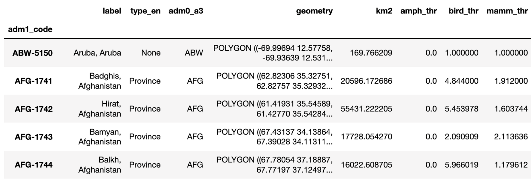
When you are done, subdivisions.head() should give you a result that looks like this:
Compute and visualize average threatened species richness across all three groups:
This is now very simple:
subdivisions['thr'] = subdivisions[['amph_thr', 'bird_thr', 'mamm_thr']].sum(1)
Recall that sum(1) computes the sum for each row.
Plot the result. How does it look?
subdivisions.plot(
    'thr',
    scheme='natural_breaks',
    cmap='YlGn',
    k=9,
    legend=True,
    edgecolor='black',
    linewidth=0.25,
    figsize=(7, 4),
)
You can drop the outlines for subdivisions and add the outlines of the countries instead (with a transparent fill).
You can plot one GeoDataFrame on top of each other. As explained earlier, plot() returns the Axes object it plots on. You can save that argument and pass it on to the next plot() command:
ax = subdivisions.plot(
    'thr',
    scheme='natural_breaks',
    cmap='YlGn',
    k=9,
    legend=True,
    edgecolor='black',
    linewidth=0.1,
    figsize=(7, 4),
)

countries.plot(ax=ax, color='none', edgecolor='black', linewidth=0.5)
Add a meaningful title and save a high-resolution version of this map (with legend) in your class folder under the following filename:
~/ee508/reports/figures/lab1/3_avg_thr_spec_richness.png
1.3.6. Find the countries with the most biodiversity-rich subdivisions#
Task
Suppose each country were to submit its most species-rich subdivision to a global biodiversity richness contest of subdivisions. Which 10 countries would win?
Find the ten countries with the highest average threatened species richness found amongst any of its subdivisions (note: this is not the country-wide mean).
Here are two possible solution paths:
Option 1: sort the subdivisions by descending species richness, remove all entries with duplicate country identifiers (keeping only the first), and pick the top 10. This gives you a subset of
subdivisionswith all of its fields. Because the fieldadm0_a3is now unique, you can use it as the index.# Sort by threat, most threatened first (on top) subdivisions_subset = subdivisions.sort_values('thr', ascending=False) # Drop duplicate county IDs (keep the first) subdivisions_subset = subdivisions_subset[~subdivisions_subset.duplicated('adm0_a3')] # Keep the top 10 top10 = subdivisions_subset.head(10).set_index('adm0_a3')[['thr']]
Important
The tilde sign (
~) inverts a boolean Series (it sets all values ofTruetoFalseand vice versa). So, the second line reads “give me all rows whoseadm0_a3value is not a duplicate of any earlier row”.Option 2: you can use groupby, a powerful way to process records (rows) in a
pandasDataFramein groups. The following line groups all subdivision by country, then returns the highest (max()) value of threatened species richness found in the'thr'column of all subdivisions in that country, sorts the resulting Series from high to low, selects the top 10, and converts theSeriesinto aDataFrame.# Get the highest value of ``'thr'`` among subdivisions in a county thr_max = subdivisions.groupby('adm0_a3')['thr'].max() # Sort, select, and cast to DataFrame top10 = thr_max.sort_values(ascending=False).head(10).to_frame()
To get a sense of what each piece of the above command is doing, run it in parts, and see what result each step returns. Note how the variable used to group the original
DataFramebecomes the index of the Seriesthr_max, and then of the resultingDataFrame.
Finally, we need to turn the three-letter codes (adm0_a3) into the actual country names. Recall that the relationship between the three-letter codes and country names is saved in countries. We can join the country name onto the states/counties using this three-letter code.
code_to_name = countries.reset_index().set_index('ADM0_A3')['NAME']
top10 = top10.join(code_to_name.rename('country'))
Save the result as a CSV file with to_csv().
top10.to_csv(path)
Replace path with a string that saves the CSV file in your class folder in the following subfolder under the following filename:
~/ee508/reports/lab1/3_top_10_countries.csv
Which are the countries that have subdivisions (at least one) with a globally significant high threatened species density? What do these countries have in common?
Finally, save the new average threatened species richness columns of subdivisions, so you can use them in the next exercise. Consider two options:
Option 1: You can either use
subdivisions.reset_index().to_file(path)(see above) to save the vector data to a location of your choice.Note on vector formats.
There are many file formats for vector data out there.
geopandasuses the file extension to figure out which format you want to save in.If you pick the shapefile (.shp) format to save your vector data, note that:
geopandasdoesn’t save the index of theGeoDataFrameto the shapefile. If you want to keep the index (as here), you need to usereset_index()before saving theGeoDataFrame.An important inconvenience with saving tabular data in the shapefile format is that you can only use column names with 10 characters, because the tabular data is saved in the .dbf format. The remainder of the column names will be automatically truncated and made unique with numeric suffixes (
~1,~2, etc.)You have to keep all companion files in the same folder as the .shp file.
If you want to skip these inconveniences, Geopackages (.gpkg) are usually the better option. Sometimes, the consume more space. Sometimes, they’re painfully slow to read and write.
My favorite format for writing, reading, and storing vector data in 2025 is Geoparquet: blazingly fast, space-efficient, and keeps your indices intact (so you don’t have to set them after reading). It is handled a little differently: to save as
GeoDataFramein the Geoparquet format, you need to usegpd.to_parquet(). To read it,gpd.read_parquet().Option 2: Use
subdivisions[your_list_of_column_names].to_csv(path)to save only the new columns to a CSV file of your choice. The index will be automatically saved as a separate column. As long as your output file keeps the unique index, you can join it back to the original shapefile the next time you want to use it.Benefit: this needs less space than the previous command (geometries are not saved) and it allows you to use column names of any length.
Downside: you’ll need one additional line of code next time you want to join the new columns to the vector data.
1.3.7. Wrap up#
You reports folder should now contain both deliverables:
~/ee508/reports/lab1/3_top_10_countries.csv~/ee508/reports/figures/lab1/3_avg_thr_spec_richness.png
Copy the two files into the same folder and compress them into a .zip archive.
Find the Assignment with the lab title on the Blackboard course website:
Upload your .zip archive.
You’re done!
I hope you enjoyed your first steps in geopandas.
Bring your questions to class!